This Web Site:
The New ArcadiaMI.com
Welcome to the new version of ArcadiaMI.com.Back in 1999 when ArcadiaMI.com site was released, we used a web development tool that is no longer supported. Furthermore, the suggested replacement tool did not import the old site, and that development environment focused on the wrong things for our purposes. So we selected a new industrial-strength web development environment. This web site is the result. All content in the old site is in the new site. The presentation of that content has changed to improve access to subject areas and individual pages. Because we rebuilt every page, we reread every page. Ouch. We edited typos and awkward sentences we found and added some of the new information we've gathered for old topics. More of that will be coming soon. Improved Access to ContentInstead of a few links on the home page that lead to topics that might lead to still other topics, every page has the same set of dropdown menus at the top of the page to provide access to every subject area from every page.
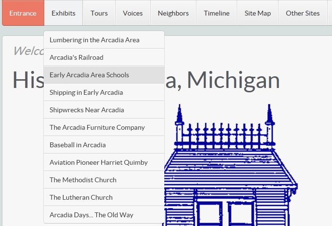
The home page also has some special menus on the right only available on that page. These menus are less about local history, which is the point of this content site, and more about the museum, the historical society, and how you can help us collect, preserve, and share local history. How you use a dropdown menu depends somewhat on the type of device you use such as a laptop with a mouse versus an iPad. For example, when you select a menu title such as Exhibits, a list of menu choices appears below. To do that on a laptop, move the mouse over the menu title, or click the title; on an iPad, touch the menu title.
Then select a menu choice such as Early Arcadia Area Schools. To do that on a laptop, click the menu choice. On an iPad, touch it. As a result, your browser displays a page for the selected menu choice such as a summary of Arcadia area schools.
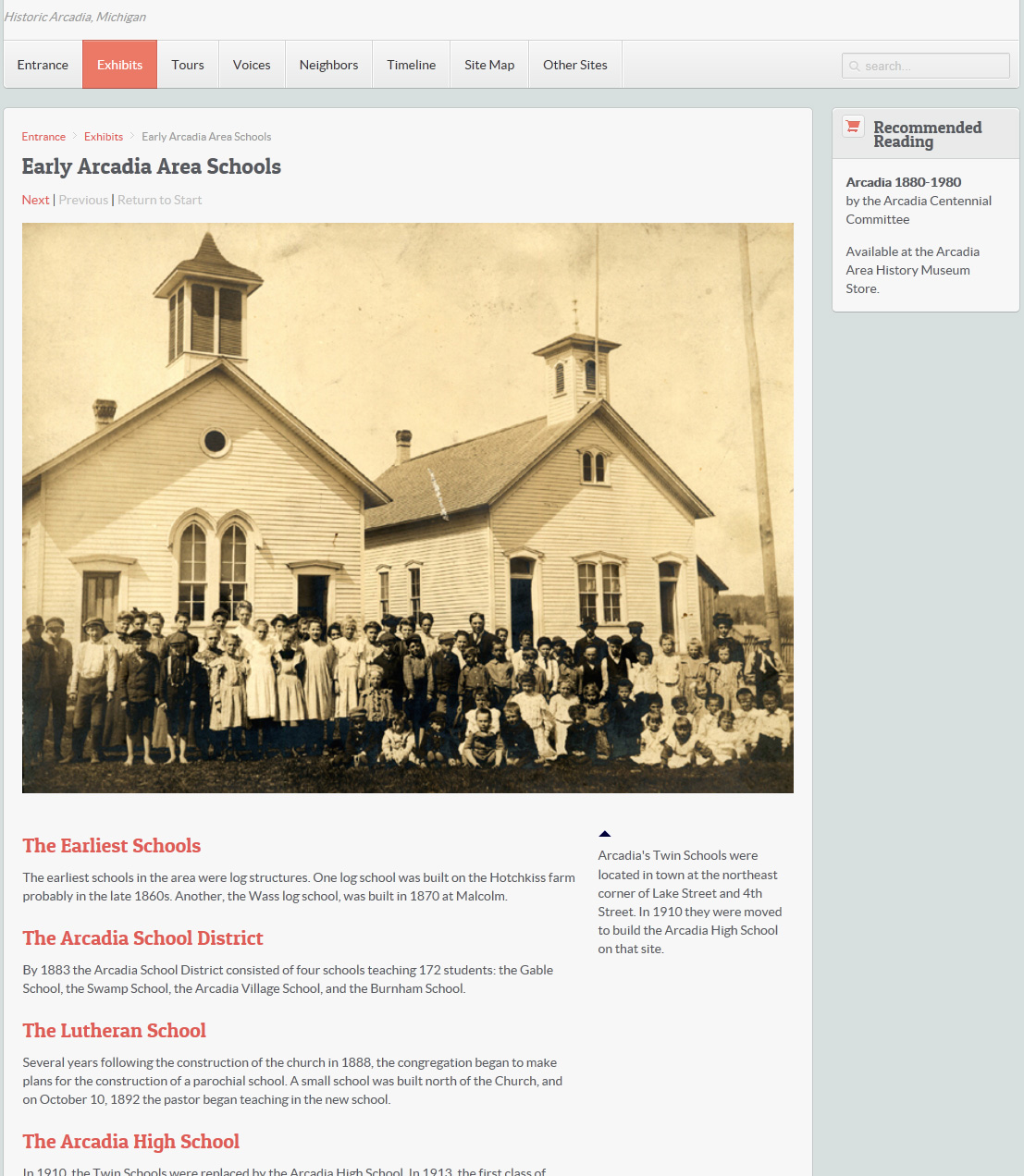
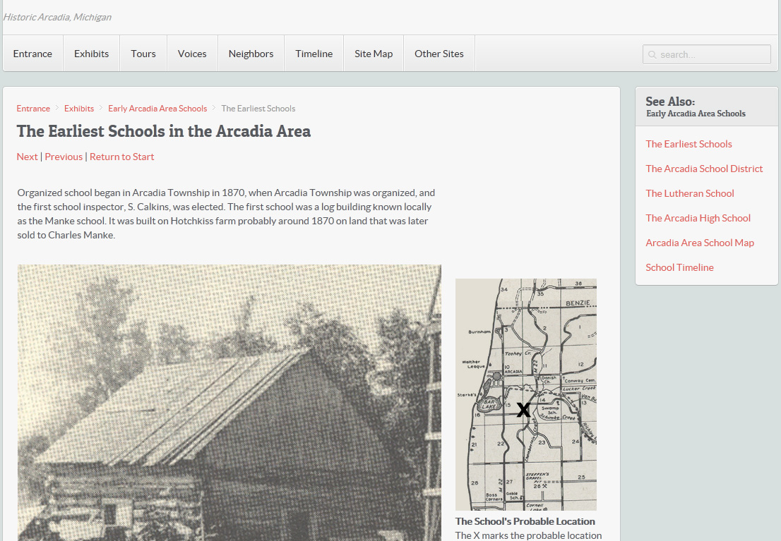
The Site Map menu (second from the right) displays a page with a supermenu to almost every page in the site. You are here.The menu title stays highlighted to identify the current context. Even more helpful are the breadcrumbs that appear just above the page title. Breadcrumbs show the path you took to get to the current page. Entrance > Exhibits > Early Arcadia Area Schools Breadcrumbs also provide a way to go back. For example, if you click Entrance, the home page is displayed again. Reading SubtopicsFor stories that use a series of pages to present subtopics in sequence, Next and Previous step through subtopic pages. In addition, See Also boxes provide direct access to any of those subtopics.
More Information boxes are similar to See Also boxes, but they provide access to other miscellaneous topics and images you might also like to see but are not critical to the story. Searching for ContentYou can find specifically what you are looking for by typing matching characters into the Search box in the upper right corner. As you type, a list of topics containing that text is displayed.
When you choose one of the matching topics, that page is displayed.
Note:Search has some issues I hope we can resolve. It seems to work better with a touchscreen. On a laptop with a mouse, use the arrow keys to select an item from the list, and use Enter to choose the highlighted item. Even then you might see a page with nothing but "404 Page Not Found." (So then why list it?) Improved ContentFor a while, we have been maintaining two sites: adding some new content and bug fixes to the old version of ArcadiaMI.com while developing the new site from scratch in a totally new development environment. This was very time-consuming and prevented us from doing much of that. Going forward all new content will only be available in the new version of ArcadiaMI.com. As we research Arcadia area history for 2014 exhibits and ongoing projects, we are developing new content that will only be communicated through the new site. See What's New. Support for More DevicesHow do you fit the same page on devices with varying screen sizes and resolutions? One way is to use a development environment that provides better support for that. Then use that tool to specify how to resize and reformat pages to fit. As you resize a page manually, or when you display the same page on different devices, the images and text columns are resized to fit, and the See Also and More boxes move. There are limits. Large images with hotlinks cannot be resized without messing up the locations of the hotlinks (so with a few exceptions we have avoided using this technique for accessing content). Also, displaying a large image on a tiny phone-size screen generally makes the image too small to be practical no matter what we do. |
So How Did We Do?This has been a major upgrade, and some issues have probably slipped through the cracks. If you see a problem, please contact us. And as always, if you have information to share, please contact us about that too. |